Watercolour Painting for Atmospheric Coastal Scenes in Brittany
- Apr 5
- 3 min read
I’m currently on holiday in Brittany for the Easter break, and I’ve been completely inspired by the coastal light, especially around Mont Saint-Michel.
The landscape here has a softness that feels almost dreamlike. At different times of day, the palette shifts from silver-grey to turquoise, deep navy blue, and warm, earthy gold. It’s the perfect inspiration for atmospheric watercolour painting, especially if you enjoy capturing light and mood.
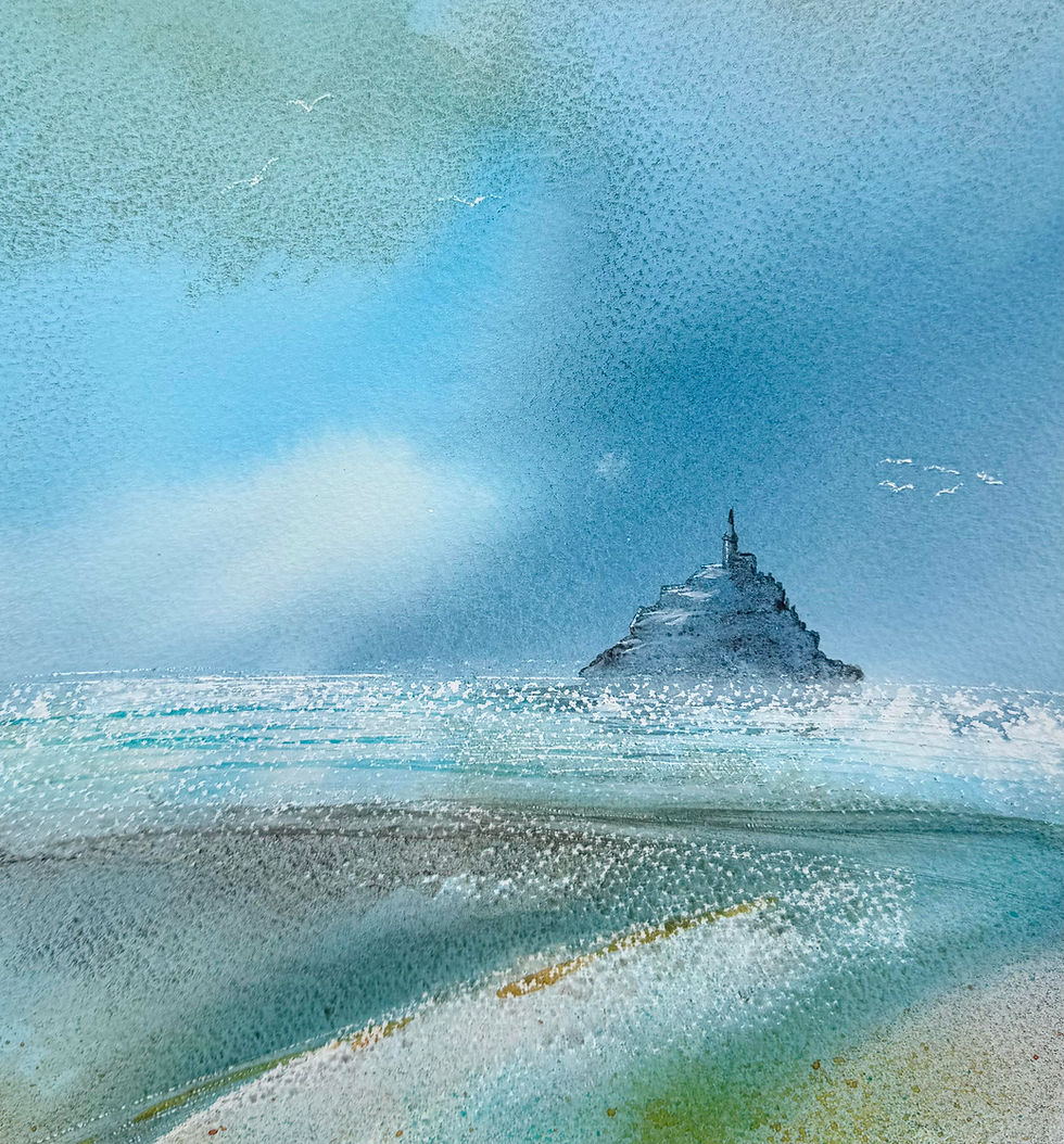
A Limited Colour Palette for Coastal Watercolour Painting
When painting coastal scenes in watercolour, I often find that working with a limited palette creates more harmony and atmosphere. On this trip, I’ve been drawn to these paints. The first three are for the main 'atmosphere' and the last two for highlights:
Winsor & Newton Indigo A deep, versatile navy blue that works beautifully for skies, water, and distant land. It can feel dramatic or शांत and calm depending on how it’s used. Recently, I’ve been mixing indigo in small pots and applying it directly onto wet paper to create soft, flowing blends.
Daniel Smith Cascade Green This is such an interesting, moody green with a natural granulation. It separates slightly on the paper, creating subtle variations that feel perfect for coastal grasses, distant seas, and those soft green tones I’ve been noticing in the landscape.
Daniel Smith Bloodstone Genuine A rich, earthy, granulating colour that brings warmth and texture. I’ve been using this to suggest the mineral tones in the shoreline and tidal areas. It adds a lovely sense of depth and unpredictability.
Schmincke Horadam Cobalt Turquoise This vibrant turquoise is ideal for suggesting light on water. I tend to use it sparingly as a highlight colour to bring freshness and contrast into the painting.
Winsor & Newton Transparent Gold DeepThis is my highlight colour - and I use it right at the end. Its warm, glowing quality is perfect for adding contrast against the cooler blues and greens. A small touch can lift the whole painting.
Using just these five colours helps to simplify the painting process while still allowing for a rich range of tones and effects.
Watercolour Technique: Pouring for Soft Coastal Atmosphere
One of my favourite watercolour techniques for atmospheric landscapes is pouring.
Working onto wet paper, I mix diluted paint in small pots and gently pour it onto the surface. The pigments flow and merge naturally, creating soft edges and organic transitions that are difficult to achieve with a brush alone.
This technique works particularly well for coastal scenes, where light and colour are constantly shifting.
With pouring, I can:
Suggest clouds and sky using flowing indigo
Introduce light and movement with touches of turquoise
Add depth and subtle variation with violet tones
The key is to let go of control and allow the water and pigment to interact. Observing how the paint moves is just as important as applying it.
Creating Expressive Coastal Watercolours
If you’d like to explore watercolour painting for coastal landscapes, try limiting your palette and focusing on one technique at a time.
This approach can help you:
Create more atmospheric paintings
Improve colour harmony
Develop confidence with water control
I’ll be exploring these ideas in more depth when I return to the studio mid-April: they lend themselves beautifully to expressive, relaxed painting.
If you’d like to explore these techniques further, take a look at my upcoming watercolour workshops here.


