From Photograph to Painting: Learning What to Leave Out
- Aug 17
- 4 min read
How I used one photograph of Lindisfarne to create two very different watercolour paintings.
One of the questions that often comes up in my workshops is how to turn a photograph into a painting without simply copying it.
Photographs can be wonderful starting points, particularly when painting outdoors isn't practical. But they can also give us far too much information. The temptation is to think that because something is there, we need to paint it.
We don't.
In fact, one of the most useful things we can learn as painters is what to leave out.
Starting with the photograph
I took this photograph recently on Lindisfarne. What attracted me wasn't every stone on the beach or every detail of the castle. It was the overall feeling of the place: the great expanse of sky and water, the distinctive shape of the castle in the distance, and the layers of shoreline leading towards it.
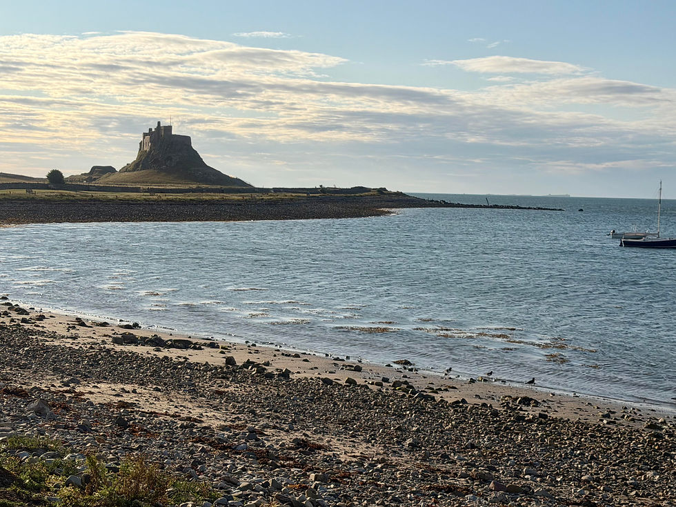
Look closely at the photograph and there's an enormous amount going on. There are hundreds of stones, patches of seaweed, ripples on the water, buildings, fences, a boat, distant land and a complicated sky.
Trying to paint all of that would not only be exhausting, it could easily result in a painting that feels rather less interesting than the scene itself.
So instead of asking, How can I copy this?, I find it much more useful to ask: What is it about this scene that I actually want to paint?
First interpretation: simplify
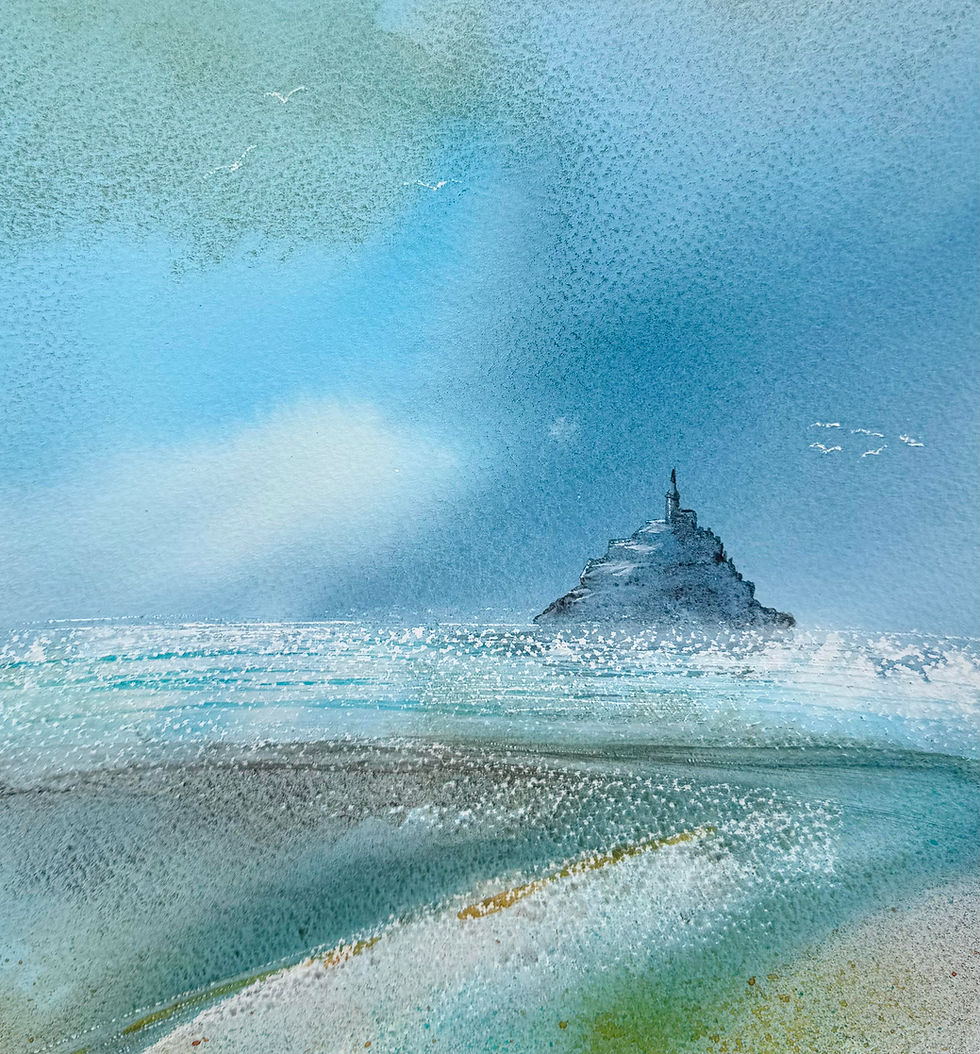
My first version was a small painting, just 19 × 19 cm.

At this scale, simplification becomes almost essential.
The castle and island have become one strong shape. The detailed beach has been reduced to loose bands of colour and scattered marks. The sea is suggested with a few horizontal passages rather than individual ripples. I've also changed things.
The boat has disappeared. The clouds are no longer being faithfully reproduced. And I've added birds which weren't in the original photograph at all.
That's an important point. You are allowed to change things.
A reference photograph is there to give you information. It doesn't have to dictate your painting.
Same photograph, different painting
I then returned to exactly the same photograph to make a larger painting, this time 38 × 38 cm.

The subject is the same, and I used the same Saunders Waterford 200lb smooth paper, but the result is quite different.
At the larger scale I chose to explore the foreground more. Instead of describing all those individual stones and plants, I used washes, texture, splashes and drawn marks to suggest the roughness and variety of the shoreline.
The sea has become stronger and more dramatic. The colours are intensified. The castle is still recognisably Lindisfarne, but again I'm not trying to reproduce every architectural detail.
And the birds have found their way into this version too.
What interests me is that neither painting is the "correct" interpretation of the photograph. They are simply two possible responses to it.
Decide what matters
Before you begin painting from a photograph, try spending a few minutes deciding what really matters to you.
It might be:
a particular shape
the contrast between light and dark
an interesting sweep of land
the colours
the atmosphere
a feeling of distance or space
Once you've identified that, everything else becomes negotiable. You can move things. Remove things. Exaggerate colours. Simplify complicated areas. Change the sky. Alter the proportions. Add something that helps the composition.
The aim isn't to make a less accurate version of the photograph. It's to use the photograph to make a painting.
Choose your colours, rather than copy them
Colour is another area where a photograph can become too prescriptive.
It's very easy to look at a reference photograph and try to identify and reproduce every colour you can see. Instead, I prefer to choose a limited palette and use that throughout the painting. The larger painting, for example, uses burnt umber, prussian blue with touches of raw umber and turquoise.
This helps to create harmony. Because the same few colours are mixed and repeated across the sky, sea, land and foreground, the different parts of the painting naturally begin to relate to one another.
It also gives you much more freedom. The colours don't have to match the photograph. They can be stronger, softer, warmer, cooler or more muted depending on the atmosphere you want to create.
So rather than asking, What colour is this in the photograph?, try asking, What colour does my painting need? A limited palette can actually make that decision easier. Fewer colours often means more freedom, rather than less.
Try it yourself
Choose one of your own landscape photographs and, before reaching for your paints, ask yourself five questions:
1. What attracted me to this scene in the first place?
Try to answer in one sentence.
2. What can I leave out?
Look for unnecessary detail, particularly around the edges and in complicated foregrounds.
3. What could I change?
Perhaps the composition would be stronger if you moved something, simplified a shape or altered the balance of light and dark.
4. What could I invent?
Give yourself permission to introduce marks, colours or elements that weren't there.
5. What limited palette will I use?
Choose just 3 or 4 colours before you begin. Don't worry about matching the colours in the photograph exactly. Instead, think about the mood you want to create and choose colours that will work harmoniously together throughout the painting.
Then put the photograph to one side from time to time while you work. Look at the painting instead. Ask what it needs.
For me, that's often the point at which painting becomes much more interesting. The photograph has done its job: it has given me somewhere to begin. Where the painting goes next is up to me.
Develop your watercolour painting
If you'd like to explore these ideas further, I run a range of watercolour workshops and courses in North Yorkshire, from one-day workshops to longer courses designed to help you develop confidence, loosen up and create paintings that feel more your own.